The Role of Watercolor Paint in Traditional Chinese Aesthetic Expression
Defining elegance in the context of Chinese artistic tradition
Chinese art's elegance often focuses more on feelings than flawless technique, following the principle of ya (雅), which balances restraint, natural elements, and deep thinking about life. The idea that "simple things can be most sophisticated" runs through these works, turning ordinary landscapes into something almost spiritual through careful use of colors. Studies found around 62 percent of those old Ming Dynasty painting guides actually connected specific color picks to Confucian ideas about moderation. This isn't just about looks either—it ties back to ethics in how we perceive beauty according to Nature magazine from last year.
Luminosity and transparency of Chinese watercolors as a marker of elegance
Old school watercolors get their bright look from stacking minerals instead of using thick, covering pigments. There's this special technique called fenggan where artists apply see-through washes only after previous layers are completely dry. The effect is pretty amazing actually, creating depth similar to how light bends through precious stones. Unlike what we typically see in Western art where opaque colors are used for practical reasons like hiding mistakes or building up intensity, traditional Chinese painting embraces transparency as something deeper. It's not just about looking good on paper but represents clear thinking and space for reflection in the artwork itself. This difference shows how cultural values shape artistic choices across different regions of the world.
Color symbolism and emotional resonance in Watercolor Paint applications
- Blues: From azurite (shiqing), symbolizing celestial realms
- Greens: Malachite-based tones representing eternal spring
- Red oxides: Iron-rich pigments conveying vitality and imperial authority
Artists historically limited palette intensity, following a 16th-century maxim: "three colors suffice where six would overwhelm." This disciplined approach ensured chromatic choices enhanced narrative and emotion without visual excess.
Harmony, restraint, and subtlety: Core principles behind elegant hues
Traditional Chinese painting draws heavily from the Wu Xing or Five Elements theory when creating color combinations in watercolors. Artists often pair dark blues with red tones following those ancient yin-yang ideas, and leave spaces on raw paper where colors don't go, which makes people think about what's missing. Looking at old pigment samples shows something interesting too. Painters back in the Song Dynasty actually used around a third less color in their scrolls compared to later generations. This wasn't just about saving money either. These early masters believed that holding back on colors made their work feel more refined and elegant somehow.
Techniques That Enhance Elegance in Watercolor Paint Applications
Layering and Gradation Techniques with Watercolor Paint
The depth found in traditional Chinese watercolor comes from careful layering techniques where each translucent wash interacts with what's already on the paper below. Artists maintain that bright quality while shaping forms, especially when painting flowers or landscapes. The gradation methods turn plain surfaces into three-dimensional scenes that resemble how light naturally shifts across objects. Art schools have conducted research showing that slowly thinning out colors creates a much more realistic atmosphere and adds subtle emotional layers to the work. Some painters even say this slow build-up process is what gives Chinese watercolors their distinctive soulful quality.
Wet-on-Wet and Dry-Brush Methods in Colored Compositions
When using wet-on-wet techniques, colors tend to blend naturally into those soft, flowing patterns that work so well for things like mist effects or delicate flower petals. This approach really captures that Daoist concept of letting things happen organically rather than forcing them into shape. On the flip side, dry brushing gives surfaces their character, whether it's rough tree bark textures or the subtle weave of fabric. Many painters find that getting comfortable with both approaches is key to creating something truly expressive. The best works often balance those random splashes of color with deliberate brushstrokes, showing both freedom and control at once.
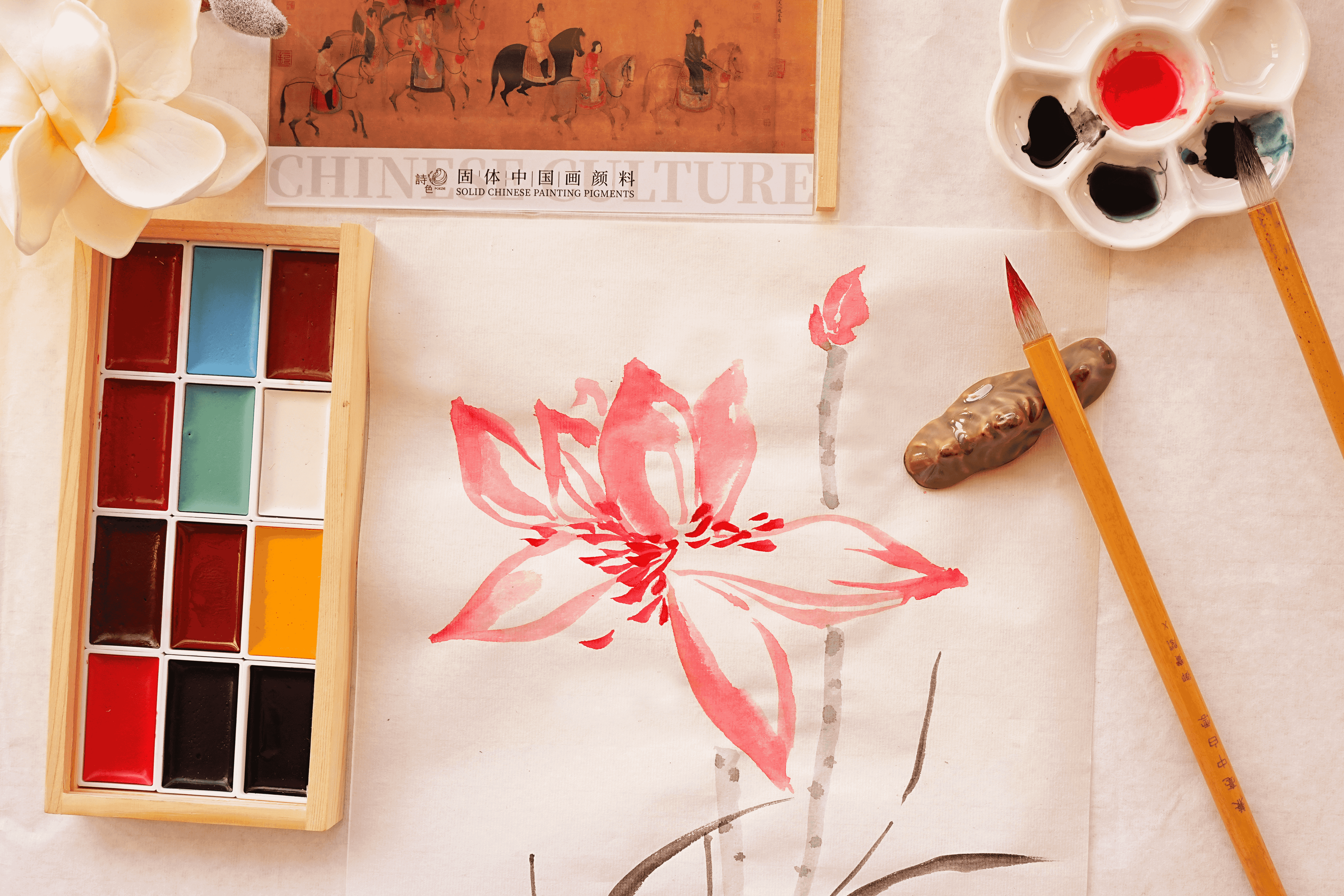
The Use of Mineral and Plant-Based Pigments in Achieving Elegance
Old school pigments like malachite green and indigo blue give off those quiet, lasting colors that somehow feel connected to the past's emphasis on moderation. The way these pigments have a grainy texture adds depth to paintings without taking over the whole piece. Take safflower reds for example they actually change their intensity depending on how wet or dry they are when applied. This means artists can get all sorts of interesting variations just from one brushstroke, creating movement and interest that's pretty impressive considering it stays so low key overall.
Data Point: 78% of Surviving Colored Scrolls from the Song Dynasty Utilize Controlled Pigment Diffusion (Source: Palace Museum, Beijing)
Analysis of 12th-century artworks indicates that nearly 8 in 10 prioritized deliberate pigment dispersion over uncontrolled washes. This prevented muddiness and preserved symbolic clarity—crimson for life force, azure for serenity—ensuring color meanings remained legible across generations.
Historical Evolution of Watercolor Paint in Chinese Art
From Natural Dyes to Modern Watercolor Paint Formulations
The roots of Chinese watercolor go back to those early Neolithic plant dyes, then things really took off during the Zhou Dynasty when they started using mineral pigments such as cinnabar red and azurite blue. When we get to the Tang period, artists began working with lapis lazuli which opened up whole new possibilities for shades of blue. Meanwhile, Song dynasty painters were getting clever with their materials, experimenting with gum arabic binders that made colors much more transparent on paper. Fast forward to Ming times, and we see some pretty amazing developments too. Tea washes mixed into the paint and alum used as stabilizers allowed for these incredible layering effects similar to what was happening simultaneously in ceramic technology. These days, modern synthetic pigments have expanded the range广泛ly without losing that special glow that makes traditional Chinese watercolors so distinctive and beautiful.
Paper, Brush, and Binder: How Materials Influence Color Elegance
The unique quality of Xuan paper lies in how slowly it absorbs watercolors, letting them spread out into those wonderful "flying white" effects that have been cherished since ancient times during the Han Dynasty era. This creates interesting areas where colors don't go, which we call negative space but really just means parts of the paper stay untouched. Artists love using rabbit hair brushes because they bend nicely yet still hold their shape, allowing for those incredibly fine lines seen in traditional Song dynasty flower paintings. There are also special binders like peach tree resin mentioned in old Yuan dynasty writings that stop colors from peeling off while keeping them rich and deep. When all these elements come together, they create what some call "breathing hues." These aren't just flat colors on paper; instead there's this amazing interaction happening between the actual paint particles, the fibers in the paper itself, and how light hits everything. That makes Chinese watercolor look so different compared to Western styles where colors tend to sit more statically on surfaces without blending quite the same way.
Comparison of Historical and Contemporary Chinese Watercolor Palettes
Back in ancient times, artists had around 18 main pigments they worked with, mostly coming from minerals and even some insects. They really liked those soft green tones made from malachite because it somehow connected to spiritual balance during what we call the Five Dynasties era. Fast forward to today's world, modern watercolors come packed with over 150 different colors thanks to synthetic stuff like cobalt blue and quinacridone reds. Artists nowadays often reach for those intense phthalocyanine blues when they want to create strong emotional contrasts in their work. But interestingly enough, many traditional approaches still stick around. According to data from the Palace Museum in 2021, about two thirds of art schools today teach students about controlled layering techniques. This shows that while new innovations keep happening, they actually build on top of old traditions instead of completely replacing them.
Monochrome Ink vs. Colored Watercolor Paint: Reassessing Artistic Hierarchy
Philosophical roots of ink superiority in literati painting
For over a millennium, monochrome ink dominated Chinese art due to its alignment with Confucian simplicity and Daoist spontaneity. Scholar-artists regarded ink washes as the highest form of philosophical expression, viewing color as decorative or commercial. Imperial academies institutionalized this bias, elevating mastery of tonal gradation (色调层次) above chromatic exploration.
The resurgence of colored works as equally elegant expressions
Museum acquisitions of historical colored scrolls have increased by 42% since 2015 (Palace Museum, 2021), reflecting renewed appreciation for watercolor’s aesthetic depth. Hyperspectral imaging confirms that Song Dynasty artists achieved color harmonies comparable to ink’s subtlety, using plant-based pigments and precise diffusion methods to maintain elegance without chromatic excess.
Case Study: Zhang Daqian’s synthesis of ink and vibrant Watercolor Paint
The 20th-century master redefined tradition by layering mineral pigments over ink landscapes, creating ethereal scenes where azurite blues emerge through ink mists. His 1967 work Lotus Pond demonstrates how synthetic ultramarine can coexist with expressive ink splashes while preserving literati principles of rhythmic brushwork and compositional balance.
Industry Paradox: Why color is underappreciated despite technical complexity
Art historians tend to acknowledge that watercolor requires serious effort in its preparation process, with many noting how much goes into materials like refined cinnabar and fermented indigo. Yet according to research published in the Chinese Art Research Journal last year, just around one quarter of big art auctions actually showcase these colorful works. There's definitely a disconnect here. For hundreds of years now, institutions have favored ink because it comes together so quickly on paper. What gets lost in this preference is all the careful work needed to keep those traditional color pigments stable and properly applied. The market seems to forget that vibrant colors aren't just slapped onto canvas but require their own special handling and expertise.
Modern Recognition and Revival of Watercolor Paint Elegance
Contemporary Artists Redefining Elegance Through Color Innovation
Artists today are breaking down old artistic boundaries by mixing watercolor's transparency with some pretty cool color layering techniques. Many are now experimenting with mineral micas and applying several layers of glaze to get that rich depth usually associated with oils, yet still keeping that delicate quality watercolors are known for. The blend of traditional methods with these new approaches has really changed perceptions at big art shows across Asia. Colored watercolor pieces are now standing shoulder to shoulder with those famous ink works in prestigious biennales throughout the region since around 2022 or so.
Global Exhibitions Highlighting the Elegance of Chinese Watercolors
Recent exhibitions at the British Museum and Guimet Museum have dedicated 37% more space to colored Chinese works compared to pre-2020 displays. Curators highlight how watercolor interacts dynamically with light and silk substrates, producing shifting visual effects that evolve with viewing conditions—a living quality absent in monochrome ink.
Trend: Digital Restoration Revealing Lost Vibrancy in Ancient Colored Paintings
Recent advances in hyperspectral imaging technology have brought to light something fascinating about those ancient watercolor manuals from the 13th century. Researchers looked at nine different handscrolls from the Yuan Dynasty in a groundbreaking study published in 2025. What they found was astonishing - the original colors used in these artworks were actually three times brighter than what we see today. This discovery is changing how conservators approach restoration work. Now they can develop special techniques to bring back those lost colors without harming the delicate paper surfaces. After all, nobody wants to damage priceless historical documents just to make them look better. These new methods mean museums and collectors can preserve these treasures for centuries to come while letting people appreciate them much closer to how they originally appeared.
FAQ Section
- Why is transparency valued more in Chinese watercolor compared to Western styles? Chinese watercolor embraces transparency to represent clear thinking and reflection, while Western styles often use opaque pigments for practical purposes.
- How do traditional color choices affect the narrative in Chinese paintings? Traditional Chinese artists limited palette intensity to strengthen emotional and narrative impact without visual excess, often connecting color choices to philosophical concepts like Confucian moderation.
- Why are mineral and plant-based pigments essential in traditional watercolors? These pigments provide grainy texture and quiet colors, enhancing depth and moderation in artwork, contributing to the unique aesthetics of Chinese paintings.
- Is color considered less significant than monochrome ink in Chinese art traditions? Historically, monochrome ink was valued for philosophical reasons, but recent trends show a resurgence of color appreciation, recognizing technical complexity and aesthetic depth.
Table of Contents
- The Role of Watercolor Paint in Traditional Chinese Aesthetic Expression
-
Techniques That Enhance Elegance in Watercolor Paint Applications
- Layering and Gradation Techniques with Watercolor Paint
- Wet-on-Wet and Dry-Brush Methods in Colored Compositions
- The Use of Mineral and Plant-Based Pigments in Achieving Elegance
- Data Point: 78% of Surviving Colored Scrolls from the Song Dynasty Utilize Controlled Pigment Diffusion (Source: Palace Museum, Beijing)
- Historical Evolution of Watercolor Paint in Chinese Art
- Monochrome Ink vs. Colored Watercolor Paint: Reassessing Artistic Hierarchy
- Modern Recognition and Revival of Watercolor Paint Elegance