Exploring Transparency in Watercolor Painting
The Science of Light and Pigment Interaction
What makes watercolor so special is how light interacts with those colorful pigments. Imagine light hitting the surface of a watercolor piece - it actually goes right through those semi-transparent colors and reflects off the white paper below. That's what gives watercolors their amazing glowing look. Water itself is really important here because when artists mix it with pigment, they can control how much color shows up on top versus what remains hidden beneath. Some experiments have shown interesting things happen when various pigments meet water. Lighter shades tend to let more light pass through them, which creates that beautiful glowing effect many watercolor artists love so much. This whole dance between light and color is basically what makes watercolor paintings feel so dreamy and magical compared to other art forms.
Transparent vs. Opaque Paints: Key Differences
Knowing when to use transparent versus opaque paints makes all the difference in watercolor work. Transparent paints let the white of the paper come through, creating that glow we love so much in watercolors. Opaque ones basically hide whatever is underneath them on the page. Most painters reach for transparent colors when they want to build up layers and get that sense of depth, whereas opaque stuff comes into play where they need something really solid looking. The usual suspects among transparent colors would be things like Quinacridone and those vibrant Phthalo blues. Meanwhile, most Cadmium reds and yellows tend to be quite opaque. Understanding this basic split changes how someone approaches their painting entirely. It opens up possibilities for playing with light effects and shadows just by selecting different types of pigment during the creative process.
How Layering Enhances Luminosity
Watercolor painters know that layering plays a big role in getting that glowing effect we all love in good watercolors, especially when working with those clear, see-through colors. When artists apply these thin washes on top of each other, they start building up depth and creating interesting textures that give paintings their special glow something most folks really appreciate about watercolor work. Take John Singer Sargent for instance he was famous for how his layers let light pass through multiple color layers, making his portraits pop with life and color. The technique actually adds dimensions to the artwork, resulting in pieces where that bright, almost magical quality grabs people's attention right away. With enough practice, watercolorists manage to show off incredible details while still keeping that soft look that makes watercolors so unique compared to other mediums.
Wet-on-Dry Layering for Precise Control
For watercolor artists who want clean lines and precise control, the wet-on-dry technique works wonders. The basic idea is simple enough: apply wet paint to paper that's already dry or has had time to set. This keeps colors from bleeding together and maintains those sharp boundaries between different areas of the painting. Newcomers often find success starting with a light base wash that they let dry completely before adding more layers on top. Patience here pays off big time since any moisture left in the initial layer will mess up the final look through unexpected blending. Many experienced painters, including well-known artist Alvaro Castagnet, swear by this approach for creating clear details and maintaining transparency in their work. It really shines when working on pieces where crisp definition matters most.
Wet-on-Wet Blending for Soft Transitions
Wet on wet is probably the best way to get those nice soft transitions and gradients when working with watercolors, which makes it great for creating those gentle, see through washes artists love so much. Basically what happens here is painters apply wet paint onto a surface that's still damp, letting colors blend together naturally and flow into each other. The tricky part comes when trying to control how much the colors bleed into one another, so keeping track of how much water is used becomes pretty important. Getting good results really depends on finding just the right mix between pigment and water, plus moving quickly enough before things get too saturated. Most art classes will spend time teaching this wet on wet blending technique because it creates amazing atmospheric effects. Teachers always stress how patience and lots of practice are needed to truly get comfortable with this delicate approach though.
Glazing to Build Depth Without Muddying
Watercolor glazing stands out as one of those techniques that really takes paintings from good to great when done right. The process involves laying down several thin, see-through layers on top of already dry paint, creating these amazing color interactions that just pop off the paper. Many beginners make the mistake of rushing between layers though. If they don't wait until everything is totally dry first, all those beautiful colors tend to blend together in ways nobody wants, resulting in that dull grayish look instead of the intended brilliance. The key trick here? Patience. Let every single glaze fully set up before moving forward. Professional painters swear by this method because it brings out so much more life in their work. When done properly, each layer lets light pass through while still contributing something new to the overall composition, making the whole piece feel deeper and more dimensional than what basic washes could ever accomplish alone.
Lifting to Restore Light in Transparent Washes
Lifting is one of those essential tricks watercolor artists use to get that light, airy look in their paintings. Basically, what happens is painters remove some of the color from the paper surface so they can see earlier layers underneath, which brings back that feeling of brightness in the artwork. When doing this, it's really important to be gentle on the paper itself. Most folks find that a slightly wet brush works pretty well, or sometimes just dabbing with a soft cloth does the trick. For bigger areas where more paint needs to go away, many artists keep a sponge handy along with plenty of clean water nearby. Look at how masters like John Singer Sargent handled his skies and clouds - he definitely used lifting techniques to create those amazing highlights while keeping everything looking fresh and alive instead of flat and dull.
Selecting Paints for Optimal Transparency
Identifying Transparent Pigments on Labels
Knowing what those paint labels mean really helps when picking out watercolors with good transparency. Most watercolor tubes will tell you whether the pigment inside is transparent or opaque somewhere on the packaging. Check for words or symbols that say things like "transparent," "semi-transparent," or just plain old "opaque." The transparent ones usually come with an unshaded square symbol showing they let light through. Artists love colors like Quinacridone Gold, Phthalo Blue, and Permanent Rose because they're so clear. Using these kinds of paints makes a big difference in how transparent our watercolor paintings turn out. I've found that reading those labels carefully saves time later when mixing colors and layering washes.
Best Color Choices for Layered Effects
Getting the color combos right makes all the difference when creating those lovely layered effects in watercolor paintings. If someone wants their work to stay transparent, they should think about complementary colors from the color wheel that actually boost each other's presence. Take Ultramarine Blue paired with Burnt Sienna for example. These two together make really striking pieces because one is so cool while the other brings warmth into play. Many experienced painters will suggest mixing both cool and warm transparent colors in their palettes, something I've noticed myself looking at various artist setups. By studying what others have done successfully, it becomes easier to try out fresh combinations without ending up with muddy tones, which helps preserve those delicate layers that give watercolors their special character.
Avoiding Chalkiness in Mixed Washes
The chalky look in watercolors really gets in the way of getting that nice transparent effect most painters want. Usually happens when there's just not enough water mixed with pigment, or sometimes because certain paints contain stuff that makes them opaque. Want to prevent it? Dilute properly and maybe try out some better quality stuff like Daniel Smith or Winsor & Newton which tend to give cleaner washes. Many artists tell stories about fighting with chalkiness until they figured out what worked best for them either through trial and error or upgrading their materials. The trick is experimenting with different ratios and finding what works for each individual style. Once past this hurdle, those beautiful translucent layers start becoming possible again.
Tools and Materials for Transparent Watercolors
Paper Weight and Texture Considerations
Getting the right paper weight and texture matters a lot when working with transparent watercolors. Most artists suggest going for something around 140 lbs or heavier (about 300 gsm), since lighter papers tend to buckle after several layers of paint. Pros often reach for 100% cotton paper because it soaks up the water and pigment better than regular stuff. Cotton holds up longer too, which means fewer frustrations when building up colors gradually. Many painters notice that cotton brings out brighter colors and deeper tones in their work, which is why it works well for folks just starting out as well as seasoned pros. Surface texture makes a difference too. Cold pressed paper has those little bumps that catch the paint and create interesting effects, while hot pressed gives a smoother finish. Some artists even mix different textures in one piece to get varied results across the canvas.
Brush Types for Smooth Washes
What kind of brush someone picks really makes a difference when it comes to getting smooth watercolor washes onto paper. There are all sorts of brushes out there for watercolor work round ones, flat ones, even those weird looking filberts each good for something different. Round brushes tend to be pretty versatile stuff they work great for both tiny details and bigger strokes across the canvas. Flat brushes? Those are my go to when I need clean straight lines or want to cover big sections quickly without much fuss. Then there's the question of what the bristles are made from synthetic versus real animal hair matters quite a bit too. Natural hair brushes just seem to hold more water and color, which helps create those nice flowing washes artists love so much. Most folks who sell art supplies will tell anyone who asks that picking the right brush isn't just important it's absolutely necessary if someone wants to get serious about learning proper watercolor techniques and actually see through their paintings properly.
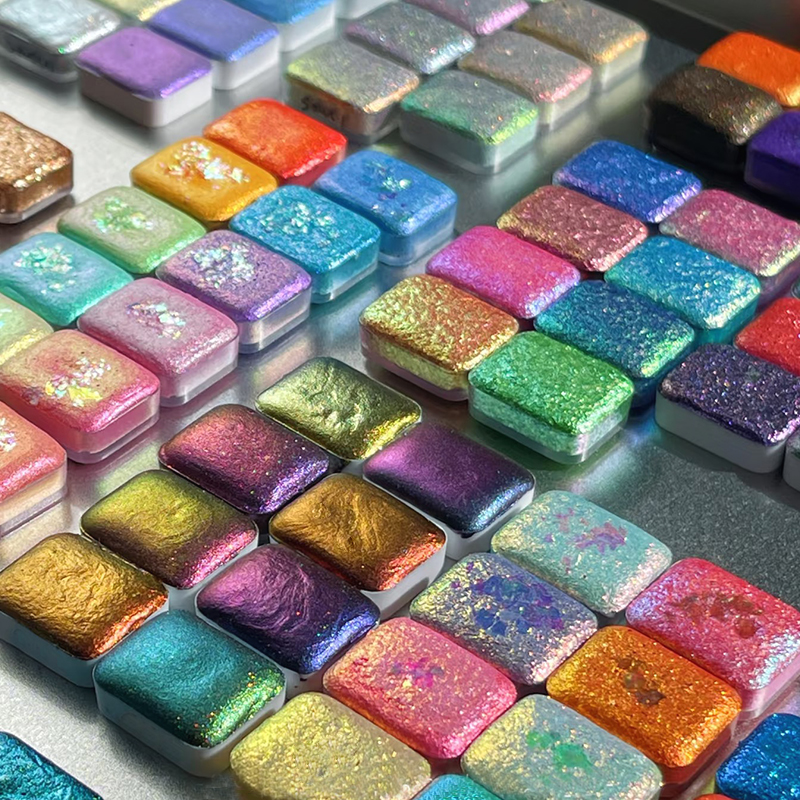
Professional-Grade Paint Sets for Transparency
For artists who want transparent, rich colors in their work, spending money on good quality watercolor sets really pays off. The best ones have lots of pigment packed inside, so colors stay bright even when diluted. Take Daniel Smith or Winsor & Newton for instance both companies have been around forever and their paints just work better than most others out there. Many painters swear by these brands because they can build up layers without muddying the color too much. Check any serious art forum and people will talk about how these paints hold their transparency through multiple washes. Beyond just looking nice, proper watercolors last longer on paper too. Artists find they can experiment with all sorts of layering tricks knowing the colors won't fade or become dull over time.
Famous Artists Mastering Transparency
J.M.W. Turner's Atmospheric Washes
J.M.W. Turner stands out among watercolor masters for those amazing atmospheric washes that really bring feeling and depth to his paintings. He worked with techniques that made the most of watercolor's transparency, creating landscapes full of nuance and showing nature in ways that feel surprisingly subtle. Take his famous piece "Rain, Steam and Speed" for instance. The way he captures mist rolling across the scene, rain falling through the air, and light breaking through clouds is just incredible. Those layered washes almost look like they're moving on the canvas itself. What Turner did with his layering methods changed how people thought about watercolor forever. Artists after him started looking at their own work differently, trying to get that same kind of depth and emotion in their creations.
Contemporary Approaches to Transparent Layers
Today's watercolor artists are really stretching what transparency means in their work, bringing fresh ideas and tech into the mix. Artists such as Cecelia Chapman and Douglas Witmer frequently play with transparent layers to express contemporary topics ranging from cityscapes to abstract shapes. Many participate in gallery shows or team up online where they experiment with blending classic watercolor methods alongside digital software and other materials. What stands out is how these creators merge old school approaches with modern innovations, keeping watercolor alive and kicking in exciting ways that keep changing and grabbing attention across the art world.
Learning from Modern Watercolor Innovators
Wanting to get better at transparent watercolor? Then learning from today's leading innovators really matters. Take Jean Haines and Alvaro Castagnet for instance. Both have created workshops and online classes specifically focused on teaching how to work with transparent watercolors. Their approach goes beyond what most people learn traditionally. Many artists find these courses incredibly helpful for improving their technique. Some students report dramatic changes in their artwork after working with these teachers. They credit much of their progress to picking up fresh approaches and thinking differently about watercolor painting than they did before.
Table of Contents
-
Exploring Transparency in Watercolor Painting
- The Science of Light and Pigment Interaction
- Transparent vs. Opaque Paints: Key Differences
- How Layering Enhances Luminosity
- Wet-on-Dry Layering for Precise Control
- Wet-on-Wet Blending for Soft Transitions
- Glazing to Build Depth Without Muddying
- Lifting to Restore Light in Transparent Washes
- Selecting Paints for Optimal Transparency
- Identifying Transparent Pigments on Labels
- Best Color Choices for Layered Effects
- Avoiding Chalkiness in Mixed Washes
- Tools and Materials for Transparent Watercolors
- Paper Weight and Texture Considerations
- Brush Types for Smooth Washes
- Professional-Grade Paint Sets for Transparency
- Famous Artists Mastering Transparency
- J.M.W. Turner's Atmospheric Washes
- Contemporary Approaches to Transparent Layers
- Learning from Modern Watercolor Innovators