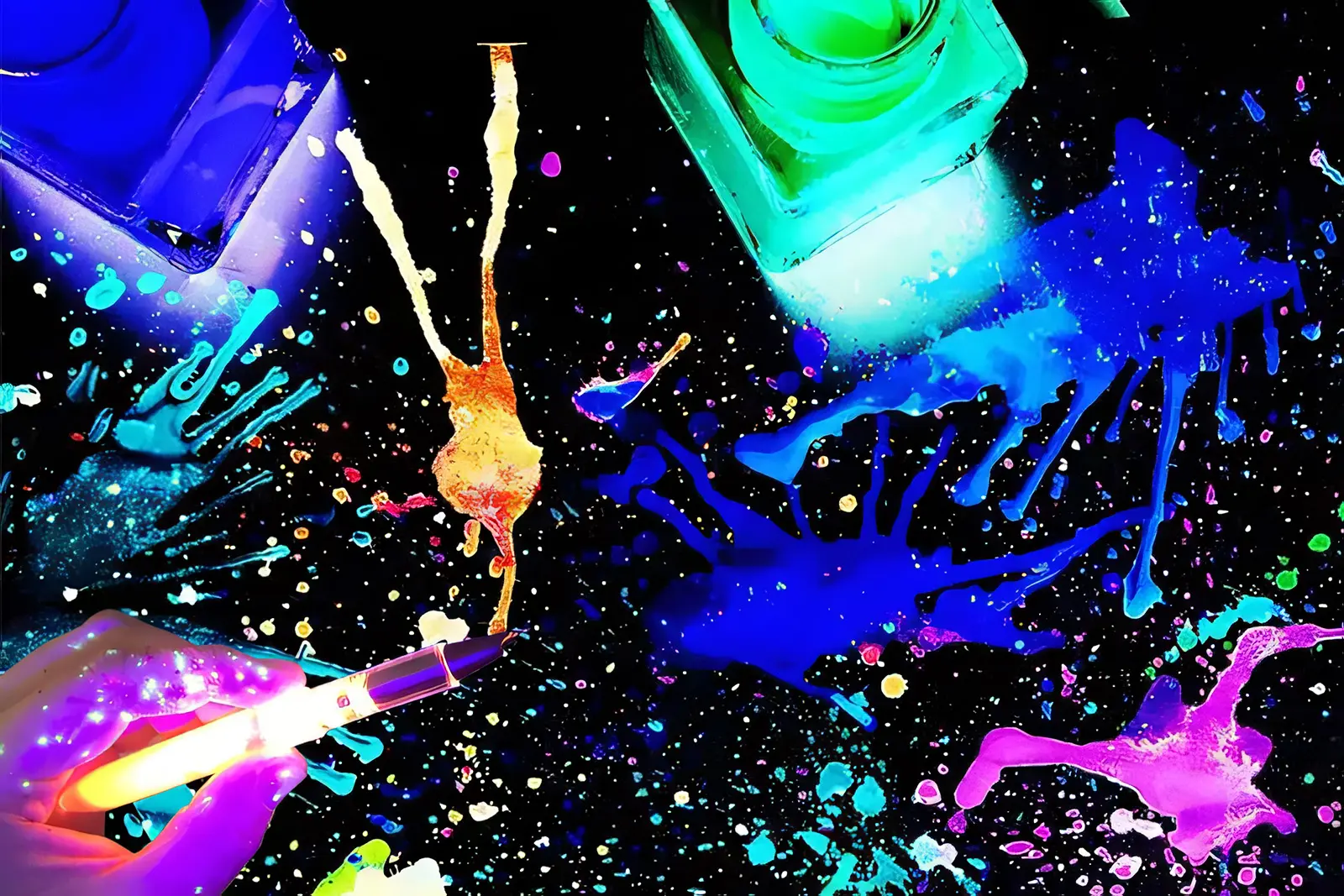
Understanding Alcohol Ink and Its Unique Properties
What Makes Alcohol Ink Different from Other Painting Media
What makes alcohol ink different from regular stuff like acrylics or watercolors? Well, it's all about those color particles floating around in alcohol instead of water. These inks dry super fast, almost instantly actually, which means they form these see-through layers that dance together on smooth surfaces without getting absorbed. The way they flow lets colors mix and separate naturally, making those cool abstract patterns that just can't happen when someone tries to control everything with brushes. Artists who have worked with them know that once dry, these inks still respond to new layers added later. This means painters can keep building up their work over time, adding depth layer by layer in ways most other paint types just don't allow for.
The Role of Alcohol in Evaporation and Ink Flow
Alcohol solvent does double duty as both a carrier for pigments and a catalyst in the painting process. Because it evaporates so fast—about five times quicker than regular water—the time available to work with it is pretty limited. Artists often have to get creative with their methods, tilting canvases at odd angles or blowing gently on wet areas to guide where the ink goes before everything dries up completely. What makes this worthwhile though is how clean the finish turns out. The solvent disappears without leaving any residue behind, which keeps colors looking bright and vivid rather than dull or muddy like what happens when other mediums take too long to dry.
Why Non-Porous Surfaces Are Essential for Alcohol Ink Painting
Materials that don't soak up liquids, like Yupo paper, ceramic tiles, or metal sheets work best since they let inks spread out naturally and mix together smoothly. Canvas and other porous surfaces tend to drink up the alcohol way too fast, which messes with how the colors move around and build up layers. Artists really appreciate the slickness of non-porous surfaces for their subtractive methods too. When working on these surfaces, artists can actually lift off pigment with alcohol to create highlights, add texture effects, or fix mistakes all while keeping the base material intact and undamaged.
Essential Tools and Materials for Alcohol Ink Painting
Choosing the Right Alcohol Inks and Blending Solutions
The best alcohol inks pack a serious punch when it comes to color intensity and lasting power. When working with these inks, artists often mix them with concentrated isopropyl alcohol at around 91% strength or above. This helps thin out the colors while giving extra time for blending before everything dries, which makes creating those smooth transitions between shades much easier. Speaking of longevity, professional quality inks stand up to light exposure way better than cheaper options on the market. According to some recent testing, they cut down on fading issues by about 40%. That kind of durability matters a lot for pieces that will be hanging on walls or displayed publicly where they'll see constant daylight.
Recommended Surfaces: Yupo Paper, Ceramic Tiles, and Metal
Most artists reach for Yupo paper when they need a reliable surface because it doesn't absorb anything and stays flat even after multiple layers are added on top. For those just getting started, ceramic tiles work great as they can be reused time and again without breaking the bank. Some folks also experiment with metal surfaces like aluminum which gives paintings a shiny quality that makes colors pop in interesting ways. According to a recent survey among artists last year, nearly eight out of ten respondents said they stick with synthetic papers whenever working on intricate projects where maintaining shape matters most.
Air Tools, Droppers, and Safety Gear for Effective Application
Using compressed air tools or those adjustable air blowers makes all sorts of interesting patterns as they spread ink around the surface. For finer details, precision droppers come in handy when placing ink exactly where needed. The thing is, working with alcohol inks means dealing with some pretty strong fumes, so wearing those NIOSH approved masks along with nitrile gloves really helps keep both lungs and skin protected from irritation. Most beginners find starter kits super helpful since they usually contain spill proof containers plus ergonomically designed tools that make getting started much easier while still maintaining proper safety standards in the studio environment.
Mastering Alcohol Ink Techniques for Dynamic Effects
Creating Fluid Movement with Isopropyl Alcohol and Blending Solution
Alcohol ink flows in a really interesting way because it's so liquidy, creating those random, sweeping patterns as it dries and moves across surfaces. When artists want their colors to spread faster, they'll often apply some isopropyl alcohol, either 70% or higher concentration stuff works fine. Lower concentrations take longer to dry which helps create those smooth gradients between colors. There are several tricks people use to control this process better. Tilting the paper or canvas at different angles lets them direct where the ink goes. Some artists drop straight alcohol onto darker sections to make bright streaks pop through. And blowing on the ink with straws or airbrushes creates those delicate feather-like shapes that look almost like tree branches growing out from the main color areas.
Achieving Cells and Organic Patterns Using Alcohol Manipulation
When alcohol evaporates at different rates throughout various layers, those distinctive circular patterns called cells start to appear. A study published last year found something interesting about this process. If someone uses alcohol that's over 90% concentration, the cells actually get about 40% bigger. And adding just a tiny bit of silicone oil creates much clearer edges around these patterns. Want to help cells develop better? Try putting one color on top of another that works well together, maybe teal over gold looks great. Spraying some alcohol mist can break up how pigments sit together, which helps create more interesting effects. Pressing plastic wrap onto ink that's still somewhat wet also gives nice texture variations in the final print.
Building Smooth Gradients with an Air Blower or Hairdryer
Getting good control over airflow makes all the difference when it comes to smooth color blending. When using a hair dryer set to low heat, around 100-110 degrees Fahrenheit works well enough to push those ink colors into nice soft gradients. Compressed air tools create something different though they tend to sweep colors across the surface in more defined directions that look pretty dramatic. Want better outcomes? Try working vertically so gravity helps things flow naturally. Keep about six to eight inches between whatever tool you're using and the actual surface to prevent unwanted splatters. And don't forget to switch back and forth between quick blasts of air and longer steady streams this lets artists really get those colors mixed just right.
Balancing Control and Spontaneity in Alcohol Ink Art
Getting good results means working with what the medium throws at us. Start by setting up basic color areas as guidelines, but leave room for the ink to do its own thing inside those spaces. For sharp lines, try using alcohol resistant tape on the edges, but let things get wilder toward the middle where creativity can really take off. A lot of folks who work with this stuff maintain journals tracking those unexpected moments when something amazing happens by accident. According to a recent poll from last year, around two thirds of artists say keeping these records helps them stay consistent and makes better choices when creating new pieces. These little mishaps often turn out to be the best parts of the whole process.
Layering, Depth, and Texture in Alcohol Ink Art
Step-by-Step Layering Process for Visual Complexity
Start by applying a thin wash of diluted ink onto a smooth, non-absorbent surface and let it dry thoroughly for around 5 to 10 minutes. When adding new layers, they actually mix with whatever colors are already there beneath them, creating those beautiful transparent depths artists love so much. Research indicates that letting each layer dry before going on top can cut down color muddiness by roughly two thirds compared to working wet on wet all the time. Between these layers, try using some blending medium to gently soften harsh boundaries or bring together contrasting colors such as turquoise next to copper tones. This technique really adds another level of visual interest and makes the whole piece look more dimensional in person.
Using Subtractive Techniques with Isopropyl Alcohol
What makes alcohol ink so special? Well, one thing stands out: how reactive it gets. Even when dry, the pigment can still lift right off the surface. Just grab some 91% rubbing alcohol and either a cotton swab or small brush, then gently rub away at areas where you want to reveal what's underneath or create those nice little highlights. Artists love using this trick for all sorts of things, but it really shines when trying to replicate natural effects like those beautiful marble patterns or aged stone surfaces that look worn from years of weathering. A recent study found that around three quarters of mixed media creators actually rely on this approach regularly. They find it helps fix mistakes in their work while also giving pieces that extra sparkle without making them look overdone.
Adding Fine Details and Textural Effects with Precision Tools
Compositions can be refined with all sorts of interesting tools like micro droppers, silicone shaped implements, and textured sponges. Artists often find these really helpful for making those tiny but important changes - things like etching delicate lines into almost dry ink, adding little metallic touches here and there, or running a thin needle through collected color to create those beautiful feather-like plant forms. When trying to get that cracked earth look, many artists will gently mist a dry surface with around 70% isopropyl alcohol. This creates those nice controlled fractures that look so natural. What separates good work from great? It's finding that sweet spot between big sweeping movements and those careful, deliberate tweaks that make all the difference in the final piece.
Enhancing Color and Light for Maximum Visual Impact
Mixing Custom Alcohol Ink Colors for Unique Palettes
To get those unique colors, artists often mix primary alcohol inks with either 99% isopropyl alcohol or some kind of blending solution. Take cobalt blue for example when mixed with just a touch of gold metallic additive creates this beautiful iridescent look that works great for painting space scenes or underwater worlds. Most experienced folks suggest doing test runs on ceramic tiles before committing to larger projects. The magic number seems to be around 3 parts ink to 1 part additive according to recent findings from the Fluid Arts Study published last year. This ratio keeps colors bright without making them too runny during application.
Strategic Color Layering to Create Depth and Contrast
Using complementary colors can really make artwork pop visually. When laying down phthalo green underneath some translucent magenta, the contrast becomes pretty striking. And those yellow-orange gradients next to indigo really help create depth in the piece. For best results, let each paint layer dry for about 45 to 60 seconds before moving on. Getting precise with overlaps is important too, so many artists swear by those 0.5mm droppers. If there's ever too much ink building up somewhere, just grab a brush dipped in alcohol and gently lift off the excess. This helps keep everything looking balanced without getting muddy.
Creating Light Effects, Highlights, and Reflections
To get those lovely light effects, drag titanium white ink across surfaces that are still a bit damp using something with a silicone tip. This creates those nice soft glimmers we all love. When working with metallic inks, remember less is more. A couple drops spread out over about four inches will do wonders for creating those shiny spots that look almost like mirrors when viewed from certain angles. These small details really bring artwork to life and guide where people naturally look as they take in the whole piece.
FAQ
What are some recommended surfaces for alcohol ink painting?
Yupo paper, ceramic tiles, and metal surfaces like aluminum are highly recommended due to their non-porous nature, which allows inks to spread smoothly.
Why is alcohol important in the evaporation process of alcohol ink?
Alcohol evaporates quickly, allowing for unique patterns and clean finishes without residue, thus keeping colors bright and vivid.
How can I create unique color palettes with alcohol inks?
Mixing primary alcohol inks with higher concentration isopropyl alcohol or blending solutions, and performing test runs on ceramic tiles can help in achieving custom colors.
What safety measures should be taken when working with alcohol inks?
Wear NIOSH approved masks and nitrile gloves to protect against fumes and skin irritation, and keep your studio well-ventilated.
How can alcohol ink techniques add depth and texture to artwork?
Using layering, subtractive techniques, and precision tools like micro droppers and silicone implements can enhance depth and texture.
Table of Contents
- Understanding Alcohol Ink and Its Unique Properties
- Essential Tools and Materials for Alcohol Ink Painting
- Mastering Alcohol Ink Techniques for Dynamic Effects
- Layering, Depth, and Texture in Alcohol Ink Art
- Enhancing Color and Light for Maximum Visual Impact
-
FAQ
- What are some recommended surfaces for alcohol ink painting?
- Why is alcohol important in the evaporation process of alcohol ink?
- How can I create unique color palettes with alcohol inks?
- What safety measures should be taken when working with alcohol inks?
- How can alcohol ink techniques add depth and texture to artwork?